For a description of generic settings common to all tools in the Toolbox, see Working in Tool Settings Dialog Boxes.
For more information, see Sections.
Reference ID: An ID is assigned by default; you can change it by typing any other value into the field. This field can contain up to 256 characters; the ID will serves to identify the Section in the project window and in the Navigator.
The Name field can contain up to 256 characters. This name appears in the Navigator palette and the title bar of the Section window.
Note: If you place a Linked or Independent marker that does not generate a viewpoint, the ID/Name fields are grey.
To Place a New Section Marker (Section Default Settings)
Use the next pop-ups to define what you want to create with the Section tool:
If you choose Create New Section Viewpoint:
its Marker Reference can contain either
•the Section viewpoint, identifying it by its location in the Navigator Project Map;
or
•the first placed drawing of the Section viewpoint, identifying it by its location in the Layout Book hierarchy
If you choose Place Linked Marker:
its Marker Reference can contain information from of any of the following:
•a selected viewpoint
•a selected drawing
•the first placed drawing of the selected viewpoint
•the first placed drawing of the selected view
If you choose Place Unlinked Marker:
the Marker Reference will not contain any linked information; you can define a custom text (First Text Row/Second Text Row parameters) in the Marker Panel below.
Reference to: shows the path (location in the Navigator hierarchy) of the chosen reference item.
To Redefine a Placed Section Marker (when a placed Section line or Marker is selected):
The pop-up fields give you feedback on the current status of the selected Marker (either Source Marker, Linked Marker, or Unlinked Marker).
Use the pop-ups to change the status as needed.
To redefine the Marker Reference: Choose from among the pop-up choices, or click the Browse button to select the viewpoint/view/drawing whose Navigator path you wish to display in the Marker. The available choices vary depending on the Marker status (Source Marker, Linked Marker or Unlinked Marker).
For an Unlinked Marker, you can define a custom text (First Text Row/Second Text Row parameters) in the Marker Panel below.
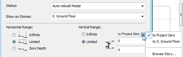
Section Status (for Source Section markers only)
Choose an option to define the status of the link between the Section and the Floor Plan.
•Auto-rebuild Model: A Section with Auto-rebuild status will be automatically rebuilt every time it is opened or brought to the front of the screen if the Floor Plan has changed.
•Manual-rebuild Model: A Section with Manual-rebuild status is not rebuilt automatically. It can be rebuilt from the model only by using the View > Refresh > Rebuild from Model command.
•Drawing: In a Section of Drawing status, the elements will be exploded into 2D drawing elements which are not linked to the Floor Plan and will not be automatically rebuilt from the model. You can, however, update the drawing to reflect recent changes made to the model.
Show on Stories (for Source Section markers only)
This pop-up list allows you to choose the stories on which to display the section marker and lines.
•If you have selected the Infinite radio button under Vertical Range, choose All stories or a particular custom story (choose the story shown in the pop-up list, or choose Browse Story to select another story of the project.)
•If you have selected the Limited radio button under Vertical Range and entered height values, two additional options are active.
Entirely in Range: The section marker and line will appear on all stories that are entirely in the vertical range defined in the height value fields.
At Least Partly in Range: The section marker and line will appear on all stories that are at least partly included in the vertical range defined in the height value fields.
Horizontal Range (for Source Section markers only)
The horizontal range defines the depth of the Floor Plan section that will be included in the Section window. Choose a radio button to define the horizontal range:
•Infinite: All elements behind the Section Line will be shown in the Section window, provided that they are not hidden by other elements.
•Limited: Only the elements between the Section Line and the limit line will be shown in the Section window. (The limit line is defined when you click with the Eyeball cursor after you finish drawing the Section line.)
Note: The limit line is a display-only Marker item, and is not shown on the Layout.
See Display of Marker Range Lines.
•Zero Depth: Only elements actually cut by the Section Line will be shown.
Vertical Range (for Source Section markers only)
The vertical range defines the height of the Floor Plan section that will be included in the Section window.
•Infinite: The Section will include the entire height of the project.
•Limited: The Section is confined to a limited vertical range. If you click this button, enter elevation values for the upper and lower limits of the Section. (Click the black arrow to choose the reference for the elevation values: to Project Zero, or to a particular custom story (choose the story shown in the pop-up list, or choose Browse Story to select another story of the project.) Elements above and below these limits will not appear in the Section window.
Use the controls in this panel to define the appearance of the Section line, Section marker and its components.
•Select a Line Type and Penweight/Pencolors for the Section Line and ID.
Note: The Section Depth (limit) line (which is defined when you create a Section of Limited Horizontal range) is an on-screen-only Marker Range item, whose line type and color are set in Options > Work Environment > On-Screen Options.
•Continuous: Choose this option for a continuous section line.
•Segmented: Choose this option if you want to display only certain parts of the Section Line. Use the checkboxes at right to define which segments to display:
- first segment
- internal segments at breaks
- last segment
Length: For a segmented Section Line, enter a value to control how much of each segment to display at the points where the segments meet, as well as at the beginning and end of the Section Line.
Choose if you want to place the Marker Head in the Middle or at the Ends of the section marker.
Use the checkmarks to enable or disable the Markers at either or both ends of the Section Line.
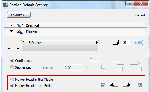
Note that if both Markers are disabled, you cannot disable all of the segments.
Select Marker Type pop-up: Select a parametric marker from this list.
The chosen marker’s 2D Symbol appears in the preview window.
Marker format: Choose a pencolor, penweight, font, font encoding, text size, height, and text style to format the marker.
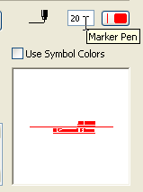
Use Symbol Colors: Check this box to ignore Pencolor setting above and use Pencolor used when the element’s 2D symbol was created.
The parameters of the corresponding GDL Object appear in the parameter list fields.
Note: Many parameters in this list, such as the options for First Text Row and Second Text Row, can also be set using a graphical interface in the Section Marker Head panel; the settings are identical.
Choose from the available Marker Heads for the parametric, GDL Object type markers. These options vary depending on the Markers loaded in your library.
Fill type: If you choose a Marker Head that includes a fill, this control is active. Choose the desired fill type for the Marker Head.
Pen: Choose a pen for the Marker Text.
First Text Row: Use these controls to define the Marker’s first row of text. The options available depend on the type of marker reference you defined in the General Panel.
For example, if you chose “Marker Reference to: first placed drawing”, then the First Text Row will show “Referred Drawing”, and the Drawing ID checkbox below is active.
Refer to the preview window of the Marker Panel to see how your choices affect the Marker.
Second Text Row: Use these controls to define the Marker’s second row of text. The options available depend on the type of marker reference you defined in the General Panel.
These controls are identical to those in the Model Display panel of Elevation Settings.
This panel is available for defining only those Sections based on a Source marker.
See Create a Section Viewpoint.
Use these controls to define how to display the contents of the Section Viewpoint.
CUT ELEMENTS
“Cut” elements are those cut by the Section plane.
Fill Cut Surfaces with: This control gives you four options for displaying the surfaces of cut elements in the Section:
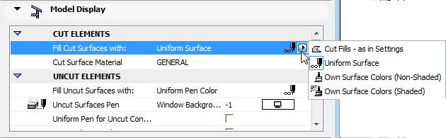
1.Cut Fills - as in Settings: Cut surfaces will use the cut fills of the Building Materials assigned to the individual elements.
In this case, an additional option is available:
Uniform Pen for Cut Elements: Check this box to use the same pens to display all the cut elements in this Section. (If you don’t check this box, the cut elements will use the pen settings of the individual elements).
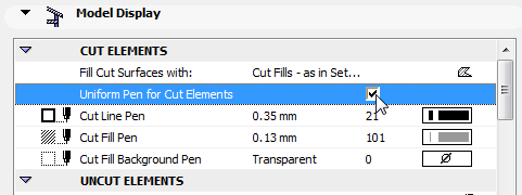
Then define the pen using the following controls:
•Cut Line Pen
•Cut Fill Pen
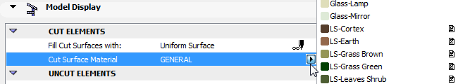
2.Uniform Surface: This option means that all cut surfaces in this Section will use a single surface.
•Choose this uniform surface using the fill pop-up of the Cut Surface parameter
3.Own Surface Colors (Non-Shaded): This option means that all cut surfaces in this Section will be shown using the surface assigned to the individual elements through their Building Material.
4.Own Surface Colors (Shaded): Same as above. The display colors will reflect shading effects.
UNCUT ELEMENTS
Choose attributes for uncut elements displayed in this Section.
“Uncut elements” are those which appear in the Section window but are not cut by the Section plane.
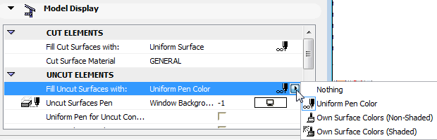
This control gives you four options for displaying the surfaces of uncut elements in the Section:
Note: Applying a fill means that you will be able to quick-select these surfaces in the Section. However, using the Fill Uncut Surface option may increase rebuild time for large models. If this is a problem, choose “Nothing”.
1.Uniform Pencolor: Choose a pencolor to apply to the fills of all uncut surfaces in this Section, and a Uniform Pen for Uncut Contours.
The next two options will display Surface colors in Section view (on uncut parts of the Section only):
2.Own Surface Colors (Shaded): Choose this option to display uncut fills in this Section using the elements’ own surface colors as defined in the Building Material. The display colors will reflect shading effects.
3.Own Surface Colors (Non-Shaded): Same as above, but the display colors will not reflect any shading effects; each surface color will be uniform over the whole surface.
4.Nothing (no color applied to uncut surfaces)
Uniform Pen for Uncut Contours: Check this box if you want to display the contours of fills on uncut surfaces in this Section. If you check it, the Uncut Contours Pen color chooser appears; choose a pencolor.
Vectorial 3D Hatching: Check this box to activate vectorial 3D hatch patterns in this Section.
Transparency: Check this box to give see-through surfaces (e.g. glass) a transparent effect in this Section.
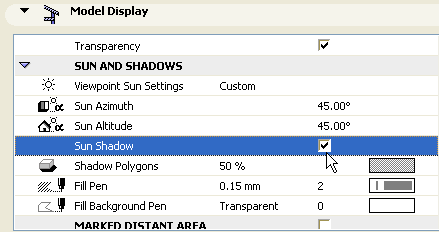
SUN AND SHADOWS
Viewpoint Sun Settings: Choose one of two sun positions relative to the Section Line:
•As in 3D Window: Use this option to inherit the sun position set up in the 3D Projection or 3D Perspective Settings dialog box.
See also 3D Window.
•Custom: Use the Sun Azimuth/Sun Altitude controls below to define a custom sun position for this Section by typing the desired values into the corresponding field.
Note: These custom values will apply to this Section only and are calculated differently from the values set in the 3D Projection/Perspective Settings dialog box.
The Azimuth value is an angle value in degrees. The line that is at a right angle to the Section line represents zero degrees. As I increase the azimuth by increasing this angle value, the sun moves toward the right - meaning the shadows start to lengthen to the left of the shadow-casting surfaces.
If you do not want the visible side of the building to be overshadowed, you should use an Azimuth value between -90 and +90 degrees.
Note: The sun position can be defined individually for every Section viewpoint.
Sun Shadow: Check this box to activate Sun Shadows. Controls defining the Sun Shadow become accessible.
Shadows work independently of vectorial 3D Hatching patterns.
Shadow Polygons: This control is available if you have activated the Sun Shadow checkbox. In Section views, shadows have no contours; however, the fill polygons are freely customizable. Choose the Fill type, Fill pen and Fill background pen using the corresponding pop-up palettes.
Note: You cannot choose a custom fill for the shadow if your uncut surface fills are set to use “Own Surface Colors - Shaded”.
Check this box to divide the view displayed in the Section Window into a “closer” and “farther” area.
If you check the box, use the appearing controls to define a unique set of colors, fills and effects for the Distant Area to indicate that they are at a longer distance from the Section Line.
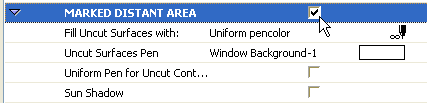
Note: You can set separate Sun Shadow Polygons for the Marked Distant Area. (The Sun’s Azimuth and Altitude settings are the same as those set up in the Sun and Shadows panel.) When choosing the “Fill Uncut Surfaces with” option for the Marked Distant Area, your available choices might be limited depending on what you chose above in the Uncut Elements section: if you set the Uncut Elements to “Own Surface Colors - Shaded”, then the non-Shaded option is not available for the Distant Area, either.
The limit where “close” ends and “distant” begins depends on how you created the Section.
•For a Section with an Infinite horizontal range, the secondary “distant” line is displayed at the place where you clicked with the Eyeball cursor when defining the Section line and orientation.
•For a Section with Limited horizontal range, the secondary “distant” line will be placed by default halfway between the Section line and the limit line
(Zero Depth sections cannot include a distant area.)
The secondary “distant” line, like the Section limit line, is an on-screen-only element. You can change its line type/color in Options > Work Environment > On-Screen Options.
BOUNDARY CONTOURS
See also Boundary Contours for an illustration of this feature.
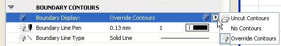
Boundary Display: Choose one of these options to display, override or hide the contours of elements at the boundary of this section.
•Uncut Contours: Boundary Contours will be displayed using the Uncut pen chosen for these elements in their own Settings dialog boxes.
•No Contours: Boundary Contours are hidden.
•Override Contours: Choose a custom Line Type and Pen with which to display the Boundary Contours.
Use the controls in this panel to define the display of Story Level lines and Story Handle Markers on this Section.
Show Story Levels: This pop-up list allows you to choose how to display story lines on this section.
•Display only: Story lines will appear only on-screen, but will not be displayed in the output.
•Display and Output: Story lines will appear both on screen and on the printed output.
•None: Story lines will not be displayed on this Section.
For more information, see Story Level Lines.
Choose a line type and pencolor for the story level lines.
Markers & Story Level Lines: The left and right check boxes determine whether to display the left and right Story Markers.
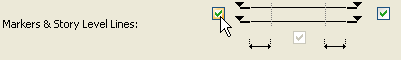
The center checkbox determines whether to display the Story Level Line itself.
Note: You cannot uncheck this box if the Offset values of the Story Handle Markers are both set to zero.
Use the Design > Edit Story Levels command to adjust story levels in this Section window.
Offset to Section Boundary: Enter a value for the offset of the Story Level line beyond the limits of the Section (defined by the Section Line drawn on the Floor Plan).
Story Marker pop-up: Choose the default Marker or another loaded Marker object.
Choose a font type, encoding, font size and marker size for the components (text and symbol) of the chosen Story Marker. Set a text style (Bold, Italic, Underline) as necessary. View the Marker appearance in the Preview window.
Use Symbol Colors: Story Markers are parametric GDL Objects. Their parameters can be adjusted in the parameter window in this panel. The list includes separate parameters for the color of the Text font and for the contour line of the Story Marker. (These are the Symbol Colors.) By default, the Use Symbol Colors box is checked in the Story Levels Panel of Section Settings. However, you can override these parameters by uncloaking the box, then set a separate uniform color for the Story Markers in this Section:
If the object definition contains a script, the Story Handle Custom Settings panel is activated.
Section Story Handle Marker Custom Settings Panel
This panel is active if the Story Level Marker type (selected in the Story Levels Panel) contains a relevant GDL script.
Use this panel to determine which Grid elements should be visible on the Section. (These controls are identical in the Grid Tool Panels of Elevation, and Interior Elevation Settings.)
Show Grid Elements: Check this if you would like to see the Grid Elements on the selected Section.
Next, there are two sets of filtering criteria for display of Grid elements on this Section: You can filter the Grid elements by Story, and/or you can filter them by Name.
For both filtering criteria, the default choice is All.
To narrow the displayed Grid elements:
Show Grid Elements by Stories: Click Selected to narrow the set of displayed Grid elements by Story: click Select stories to choose the stories whose Grid elements you want to display. (If a Grid element is visible on the selected stories, then it will be visible on this Section as well.)
Show Grid Elements by Name: Click Selected to narrow the set of displayed Grid elements by Name: click Select elements to select individual elements.
Note: These two filtering criteria are related as an “AND” statement: if you set filters both by Story and by Name, then the Section will display only those Grid elements which fit the both the Story criteria AND the Name criteria.
You can dimension the Grid elements on this Section using one or both of two different dimension types:
Dimension lines: Check this to place a dimension between each grid line on this Section. Enter the vertical location of this dimension chain and set the reference level.
Total Dimension: Check this to place a dimension line between the two grid lines on the far left and far right end of this Section. Enter the vertical location of this dimension chain and set the reference level.
These dimension lines will use the default dimension settings. When a new Grid line is inserted on the Floor Plan and it appears on the Section, then it will be included in the dimension chain.
Auto-stagger Grid Markers if they overlap: Check this to automatically stagger Grid markers sideways to avoid overlapping, if the markers would otherwise overlap.
Show non-perpendicular Grid Elements: By default, the Section will display only those Grid elements that are perpendicular to the Section line and are located within the Section’s depth. (This means that, by default, no Grid elements that are curved on the Floor Plan will be displayed on a Section.) Check this to show Grid elements which are not perpendicular to the Section line, but which intersect the Section on the Floor Plan. These Grid lines, including curved Grid lines, will appear on this Section at the intersection point with the Section line.