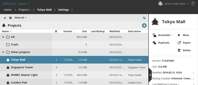
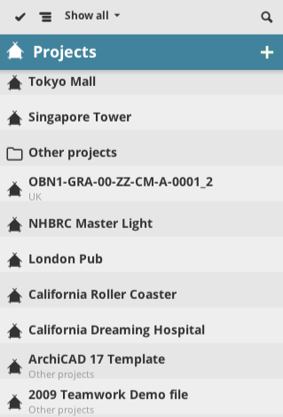
The Navigator lists all elements of the currently selected content type. Each Content type has a Root item (which acts as a folder) shown in the Navigator.
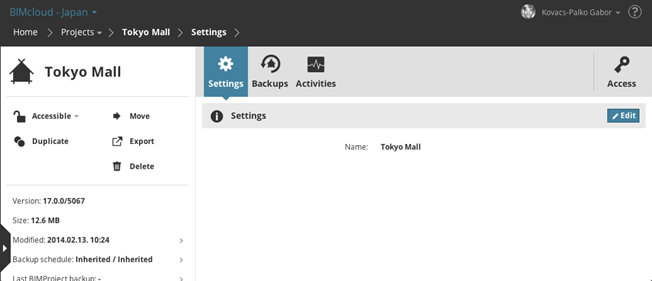
Click an element to select it and display further information about it.
Note: Depending on your permissions, the elements you see here, and the information displayed, can vary.
New Item Function
The Root items of the Navigator contain a + button, which is a shortcut to create new items.
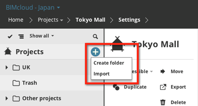
The new item will be created in the currently selected level of the hierarchy. (If the content type does not have a hierarchy in the Navigator, then it will be created in the Root folder).
Note: Depending on your permissions, the create function might not be available for you.
Navigator Layouts
The Navigator can switch between three different layouts:
•Single Column
•Hidden
•Expanded

Switch between the layouts using the arrows on the right side of the Navigator.
Single Column Layout
Only the name and path of the item is visible.
Click the slide arrows on the right side to expand or collapse the layout.
Hidden Layout
The Navigator is not visible. Click the arrow on the side of the screen or swipe from left to right to open it.
Expanded Layout
When the expanded layout is active, only the summary is visible; the content panels for the selected item are hidden. More detailed information is available in a table format. You can sort the columns to find the information you are looking for.
Layout Limitations for Small Screen Devices
•Expanded layout is not available due to the lack of horizontal space
•The Navigator automatically hides itself after a successful item selection
Navigator View Type
The Navigator can display items in two different styles:
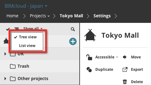
•Tree view
•Flat list
Tree View
On the Projects and Servers pages, all Navigator items can be displayed in a tree style view according to their position in the hierarchy. Open/close the tree branches by clicking the arrow on the left side of the folders.
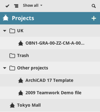
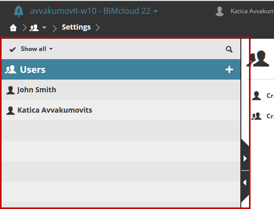
Note: The User/group and Roles content types have no tree view, because those content types use no hierarchy.
Flat List
Items are displayed in a flat list regardless of their position in the hierarchy. However, the item’s path in the hierarchy is displayed in a second line.
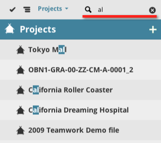
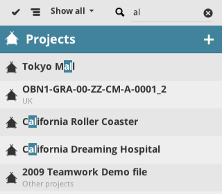
Search results are always displayed in a flat list. Cancel Search to return to the tree view.
Select or Search List items in the Navigator
Select an element by clicking on it.
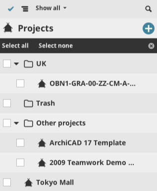
•Multi-select: Activate multi selection by clicking the checkmark icon on the top left of the list
•Select an item from the Filter pop-up to narrow down the displayed items. The available quick filters depend on the currently selected content type.

•Search: Click the Search icon to open the search field and type your search term. The list will display the search matches. Click the x icon in the Search field to cancel the search and display all elements again.