Custom Settings for Symbol Labels
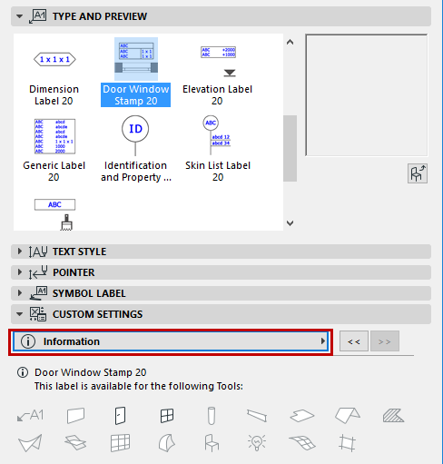
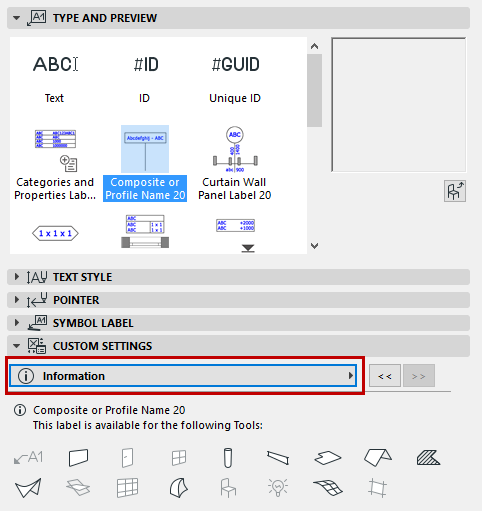
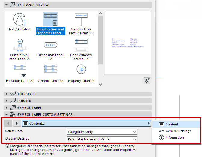
Each Symbol Label has a Custom Settings panel in the Label Tool Settings dialog box. The parameters are divided among 3-5 tab pages, as shown here:

Use these tab pages to set preferences for label content, positioning and format.
Note: Not every tab page is available for every label type.
•To make repositioning easier, many labels have a reference point, which remains in place even after you change the label size or content.
•Many labels have several header formats available, and the leader line can be turned off, where applicable.
Most of the settings are self-explanatory. The following sections contain some additional tips for using these controls:
Define Content of Symbol Label
Defining Dimension Units in Labels
Select Surface (for Surface Label)
Define Content of Symbol Label
Use the Content Setup tab page to define the information displayed in the label.
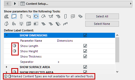
For the Generic and Dimension labels, the available element types - and therefore the list of possible parameters - is very extensive, and the Content Setup tab page looks like this:

Since you can attach the label to different element types, the label content may vary, depending on which element it is attached to.
•Show parameters for the following tools: This control filters the content list in the bottom part of the dialog box. Select the tool(s) whose element parameters you want to choose from. (By default, all tools are selected.) The more tools you select, the greater the number of available parameters.
Note: If a particular tool is not selected in the “Show parameters for” section, you can still place this label on such elements, provided the element has a value that can be displayed by the label.
•Define Label Content: Select the parameters whose values you want to display in the label.
–If you don’t see a tool-specific parameter in the list, make sure that the corresponding tool icon is selected in the “Use with” section above.
–Parameters shown with the circle marking are not relevant for one or more of the selected element types (in the “Use With” section). Thus, label content might vary, depending on the element type to which it is attached.
Defining Dimension Units in Labels
When specifying dimension units for label display, many labels include the option “By Project Preferences”. This means the dimension will be displayed in the units defined for it at Options > Project Preferences.
•For volume dimension data shown in labels, set the units at Options > Project Preferences > Calculation Units.
•For all other dimension data shown in labels, set the units at Options > Project Preferences > Dimensions, using the relevant dimension type options. See Choose Dimension Type.
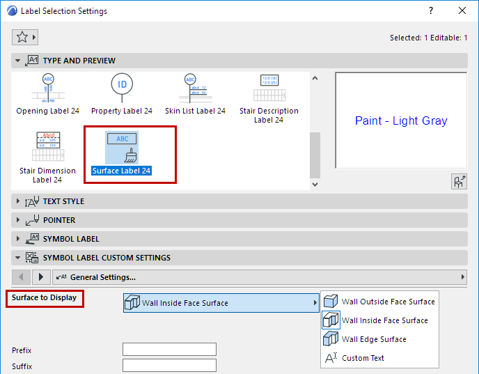
Select Surface (for Surface Label)
The Surface Label displays the name of the element’s selected surface. You must first select the particular element surface in Label Settings:
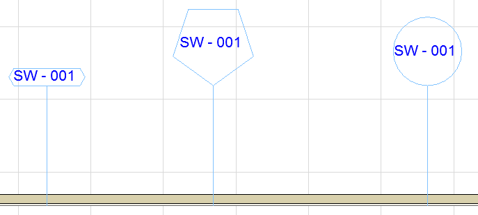
For labels having a frame, you can select among different shapes.
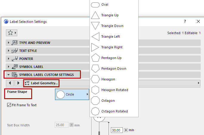
Set this option in the Custom Settings panel, in the Label Frame Style or the Label Geometry tab page.
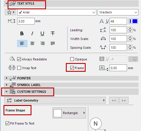
The Frame Shape control is only available if you have activated a Frame, in the Text Style panel (as shown below).
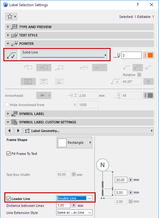
If you have activated a Label’s Pointer Line, in the Pointer Panel, then these Pointer Line settings will prevail (the Label will not use the Leader Line defined on the Custom Settings panel.)
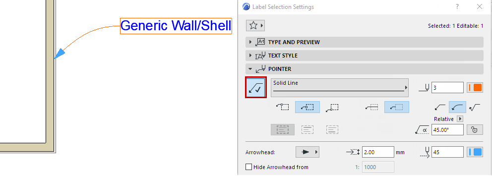
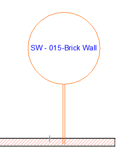
If you are not using the Pointer Line (the Pointer button is off), then the Leader Line (defined in the Custom Settings panel) will be used. The line and pen settings of the Leader Line are also set on the Pointer Panel.
This is an information-only page. It shows which element types the selected Label is available for.
