For a description of generic settings common to all tools in the Toolbox, see Working in Tool Settings Dialog Boxes.
For general information on the Grid tool function, see The Grid Tool.
Use the controls in this panel to define the Floor Plan attributes of the grid element.
Grid Line: Select the desired representation of the grid line. It can be Hidden, Segmented or Full.
If you select Segmented, enter Segment Length in the field to the right.
Select a Line Type and pen color for this Grid Element.
Show on Story: From the dropdown list, select where you would like to see the Grid Element.
•Current Story Only: The Grid element will be shown only on the current story.
•One Story Up and/or Down: The Grid element will be shown on the current story, plus one story up and/or down.
•All Stories: The Grid element will be shown on every story of the project.
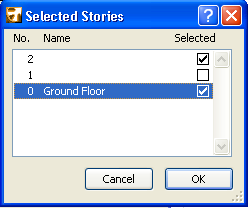
•Custom: Choose this option if you wish to set any other combination of stories. The Selected Stories dialog box appears.
(Once you set these Custom Settings, use the Edit Custom option to edit them.)
Markers: Select either, both or none of the two checkboxes to indicate the display of markers on either end of the Grid line.
Staggering: When you stagger grid markers sideways, a given grid line segment will be staggered together with the markers.
Set the default value of this staggering length here.
Grid Tool Section/Elevation Panel
This description applies to the display of Grid elements in both Section and Elevation windows.
Use the controls in this panel to define the Section attributes of the Grid element.
General/Custom: Use this pop-up to apply either the General settings to the selected Grid element, or to set Custom settings for the selected Grid element in this Section only.
Every Grid element has one “General” section settings and any number of “Custom” Section settings.
A Grid element using General section settings will be displayed identically in every Section that it appears in.
Custom settings for selected Grid elements are available only if you open Grid Element Settings from a Section window. Custom settings for a Grid element are applied only in the current Section window.
Thus, the same Grid element can be displayed in different ways, depending on which Section it is in.
If you apply Custom settings to a Grid element in one Section, then when opening the same Grid element in another Section, it will be displayed using its original settings, because Custom settings apply to a given Grid element only in a single Section window. However, you can use the Copy from command to copy those Custom attributes from the other Section, and use them for the Grid element in the current Section, too.
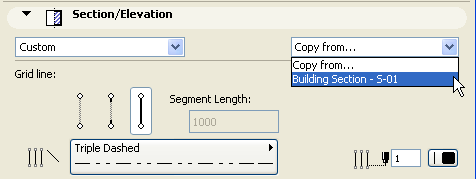
Grid Line: Select the desired representation of the grid line. It can be Hidden, Segmented or Full.
If you select Segmented, enter Segment Length in the field to the right.
Select a Line Type and pen color for this Grid Element.
Markers: Select either, both or none of the two checkboxes to indicate the display of markers on either end of the Grid line.
In the two fields to the right, enter the height level of each Grid line marker as displayed in Sections, and choose a reference level (default: Project Zero) for measuring this height level.
Note: The actual position of the Grid line (unlike other ArchiCAD elements) will change if the Reference Level is changed.
Staggering: When you stagger grid markers sideways, a given grid line segment will be staggered together with the markers.
Set the default value of this staggering length here.
Use this panel to define the logic by which each placed Grid element is named.
Generate names automatically: Select this option to auto increase the name every time you place a Grid element.
•Start at: This field shows the next name value to be assigned to the next placed Grid element.
•Prefix: a static text displayed in front of each auto generated name.
•Suffix: a static text displayed following each auto generated text
•Style: Choose a style for the auto generated Grid element names: either numbers (1,2,3,...), letters (A,B,C,... or a,b,c,...), or Roman numbers (I,II,III,IV,...)
A preview of the next name value to be assigned to the next placed Grid element is visible in the field next to Custom.
Custom: Click this button to override the auto generated name and to assign any other name to the Grid element.
Use this panel to define the appearance of the Grid element’s markers.
Font Type: Use the Font pop-up field to choose from available fonts loaded on your computer.
Font Script: Use the pop-up field below to choose a Font Encoding standard (Font Script in the Info Box) available on your computer (Windows only).
For more information, see Note on Font Encoding in ArchiCAD.
Font Size: Enter the height of the marker text. The unit of measurement depends upon your working units (Options > Project Preferences > Working Units).
Marker Size: Enter the height of the marker here
Text Format: Check one or more of the following checkboxes to apply formats to marker text.
•Bold
•Italic
•Underline
In the parameter window, set the following parameters for the Marker object:
Marker Pen and Text Pen: Click this item, then click the black arrow to pop-up the pen selection palette. Select the desired pen colors for the marker element and for its text.
Marker Shape: Click this item, the click the black arrow to pop-up a list of available marker shapes. Choose one.
Connect Grid Line to: Click this item, the click the black arrow to pop-up a list of available choices of where to connect the grid line to the marker. (Not available for circular marker shape).
Use this panel to control whether and how the Grid Element appears in the 3D window. 3D Documents created from a 3D window showing Grid elements will also display Grid elements.
Display in 3D view: Check this box to display the Grid element in the 3D window. If this box is not checked, all other controls in this panel are grayed.
Vertical position: Enter the vertical position of the Grid Element in 3D. Click the black pop-up arrow to choose a reference level from which to measure its vertical position.
Show as line: Check this box to display Grid elements as line only in the 3D window. If you check this option, Grid elements will not be visible in renderings, and the rest of the Grid line controls in this panel are grayed. Unchecking this option means that Grid lines will be displayed in 3D with surfaces and a physical cross-section, and will be displayed in renderings.
Grid Line Surface: Set the surface of the Grid line’s body.
Grid Line cross-section: Select between circular and rectangular cross sections and set their size
Marker Text Surface: Set the marker text’s surface
Text Follows View: Check this box to rotate the marker texts to always face the viewpoint. Note: This option is effective only in perspective views.