Format Options (Interactive Schedule)
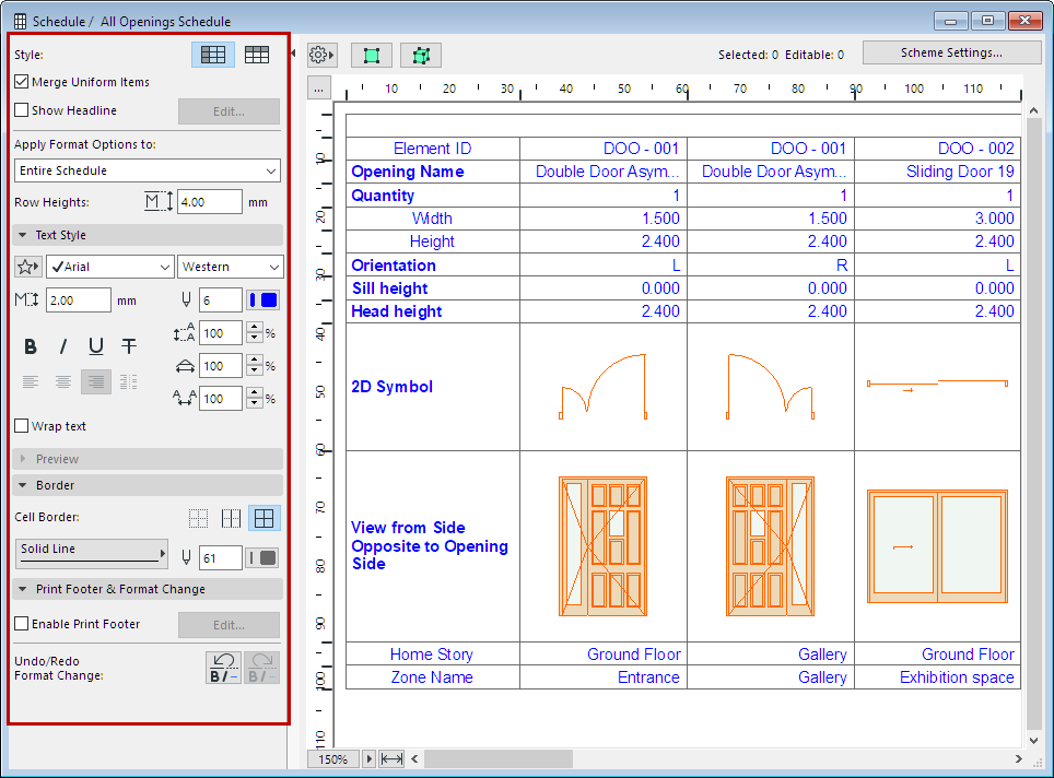
Use the formatting controls at the left side of the Schedule Window to format the current schedule.

Adjust Zoom/Fit to Current Window
Scheduled Elements on Locked or Hidden Layer
Select Schedule Items on Floor Plan/3D
Do one of the following:
•To adjust Schedule Cell Size, click the three buttons at the top of the schedule and use the dialog box.
Use the Resize buttons to automatically adjust rows and columns to fit the content, or enter width/height values as needed (multi-select available for the listed items).

•Set the Row Heights field
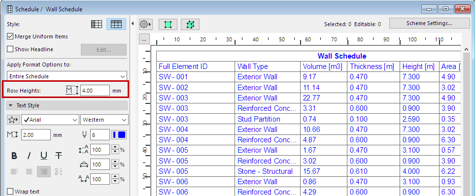
•To adjust individual row or column heights, manually drag the cell boundaries on the top and left side of the schedule.
•Double-click the row or column edge to fit its contents.
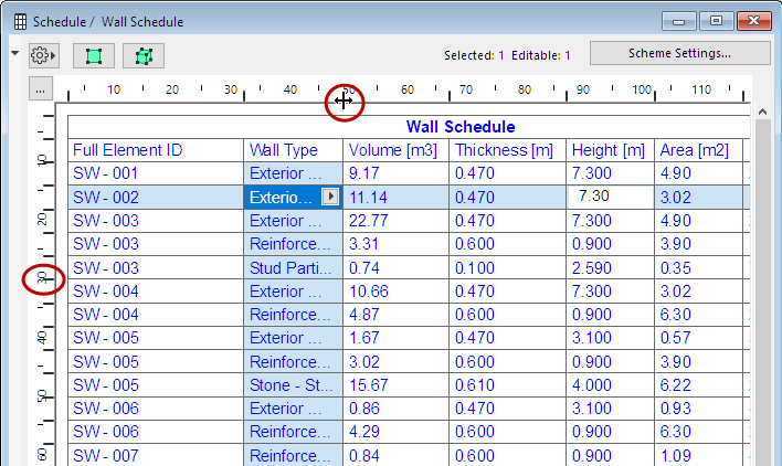
Double-Click: Fit Width to Cell Contents
Adjust Zoom/Fit to Current Window
•Adjust the Zoom using the pop-up from the bottom scrollbar
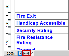
•To fit the schedule to the current window size, click the Fit to Width icon
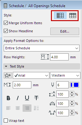
From the two Style buttons, choose to display the Schedule fields by either rows or by columns.
Check this box to group the Schedule’s uniform items in a single record. If it is unchecked, all items will be listed individually.
For items to be uniform, their “core” values must be identical (e.g. same element type, surface, orientation). Core values are typically the values that you define in a Settings dialog.
If the only difference between two elements is a calculated value (e.g. area, volume), they are still considered uniform.
Length values are more complicated:
•Element length is not a core value; it is usually calculated based on graphical input. Thus, Wall length differences are ignored, and otherwise identical Walls are merged in the Schedule.
•Element height is a core value; it is usually defined in settings. Thus, Wall height differences are considered, and otherwise identical Walls with different heights are not merged in the Schedule.
•Expression-defined properties that return a Length-type value are always considered “core values”. Thus, when listing elements with such properties, they are not merged unless these property values are identical.
Choose the items that you will format using the controls below.
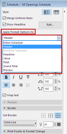
The Preview refers to the element Preview pictures, if any, in the Schedule. (See Format Preview Picture.)
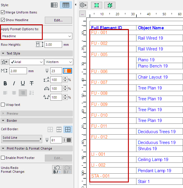
This option lets you display data from one or more schedule fields in a separate row, above (or to the left) of the rest of the element data.
Click Edit to open Headline Settings, to define the content and appearance of the headline data:
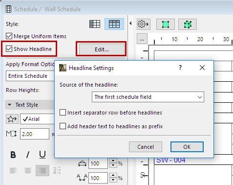
•Source of the headline: The first (or first two, or first three) field(s) of the schedule can be displayed in the headline.
If the records are displayed by rows, the headline data appear in a separate column to the left of the other fields.
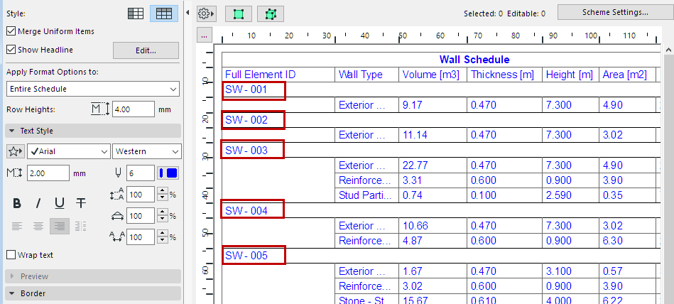
•Insert separator row before headlines: Check this box to insert an empty row before each headline row.
•Add Header text to headlines as prefix: Check this box to add the Column/Row header name as a prefix to its value in the headline row.
•Customize the text format of Headline data, as needed: at Apply Format Options to, choose the Headline item.
See also Schedule Headers, below.
Set text format options for the item type selected at Apply Format Options to:
Note: Not available if you have selected “Preview”.
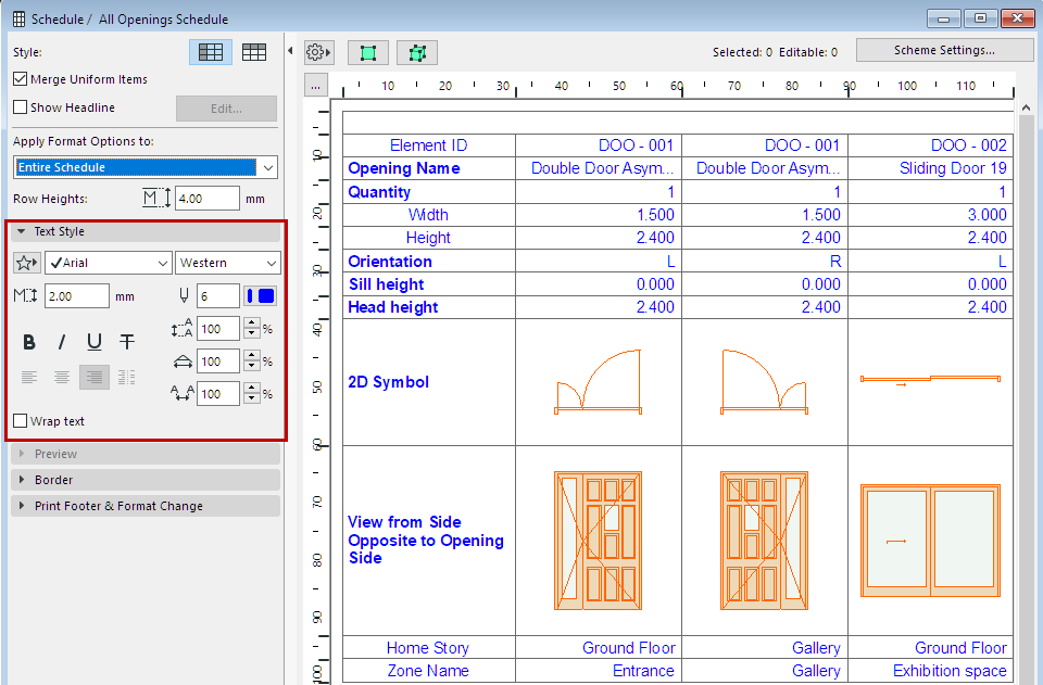
Text Favorite: Click the pop-up to apply Favorites saved with the Text Tool.
See also Apply a Favorite.
Font Size: Enter the font height, in mm (metric units) or points (imperial units), depending on the choice defined in Options > Project Preferences > Working Units.
Font Style: Choose Bold, Italic, Underline, or Crossthrough.
Note: The font styles of Header cells can be customized individually. (All other cells are modified collectively, by type.)
Leading: This control modifies the leading value (vertical line spacing), as a percentage. Enter a number or use the up-and-down arrows to change the value in increments of 25 percent.
Width: Modify the text character width by entering a percentage value.
Spacing: Modify the spacing between text characters.
Wrap text: Check this option to automatically wrap text so that it fits into the column width.
Set cell border options for the item type selected at Apply Format Options to:
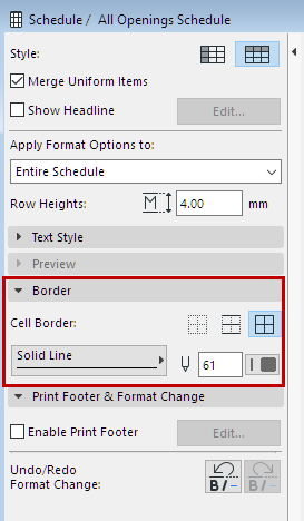
•Choose one of three icons to set which cell borders should be displayed.
–None: No border will be drawn.
–Separators Only: The selected line type selected is displayed below each item. If the records are displayed by columns, the line is displayed on the right.
–All Borders: Selected line type is displayed on all sides of the cell.
•Choose a Line Type and Pen for the cell border lines.
See Previews and Pictures in the Interactive Schedule.
1.Check the Enable Print Footer box to add a print-only footer to the Schedule.
2.Click Edit to open Footer Settings and define the Footer.
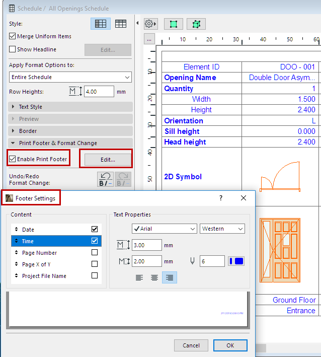
–Content: Check the items that should appear in the print footer. Use the arrows on the left to modify the order of footer items.
–Text Properties: Set the text format options for the printable footer. Use the preview at the bottom as a guide.
3.Click OK.
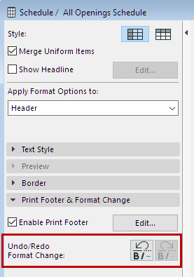
Use these buttons to undo/redo the last changes made to the formatting of the Interactive Schedule.
Scheduled Elements on Locked or Hidden Layer
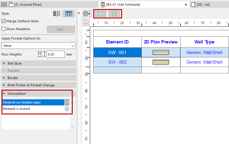
You cannot edit or select scheduled elements that are on a locked or hidden layer.
This information is displayed for selected elements in the Information panel:
See also Select Schedule Items on Floor Plan/3D.