
For a description of generic settings common to all tools in the Toolbox, see Working in Tool Settings Dialog Boxes.
See also Labels.
Double-click the Label tool in the Toolbox.
The Type and Preview panel defines the labeling options for elements. A preview is available if you have selected a symbol label.
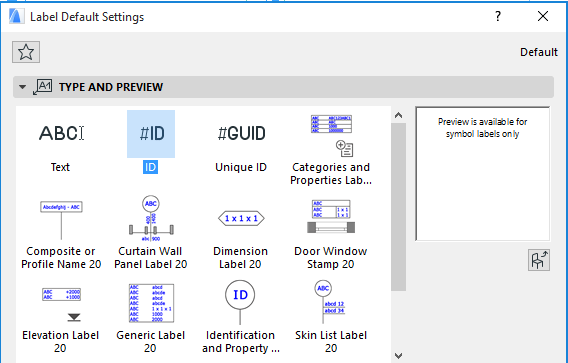
Select a Label type from the left-hand window.
•Text: If you choose this option, ARCHICAD will place the Default Text defined in the Text Label Panel of Label Settings. (See Text Label Panel.)
•ID: If you choose this option, the Label will contain the ID of the associated element. Changing the ID field of the selected element will update the Label, too.
•Unique ID: Each ARCHICAD element has a globally unique, automatically generated ID which is conserved throughout the life of the Project. If you choose this option, the Label will contain this unique ID; however, this unique ID is not accessible or editable by the user.
Note: If your Geometry Method is set to Independent (not associative), then the ID or Unique ID label will be placed as a Text label, without any element-specific information.
•Symbol Labels available from your current Library. Use these labels to display element-specific parameters.
See also Symbol Labels for Element Information.
•Load Other Label: Click to load Labels from other locations.
The Preview is available for Symbol Labels only.
The Text Style panel of the dialog box contains the same controls as described for the Text Tool here: Text Style Panel.
The Label Tool Text Style panel contains these additional controls:
•The Always Readable option (on by default) means that the program will automatically “flip” the text to make it legible on screen (as opposed to upside down) regardless of the view’s orientation. This automatic “flip” occurs if the text is at an angle between 90 and 270 degrees.
•Wrap Text: This checkbox “locks” the width of a placed text block (including those placed as non-breaking text blocks) so that if you add text that would extend beyond the text block margin, it will wrap to the next line.
Note: If you leave this box unchecked, the text block size is determined by the length of the text it contains.
•Opaque: Check this box if you want a background color for your label that differs from the screen’s background color. Checking the box activates the pencolor selection settings at right: open the pop-up palette to choose a color.
•Frame: Check or uncheck the checkbox to display your Label text box with or without a frame.
•Text Offset: If desired, offset the Frame from the text by entering an offset value in the field at right.
Click the Pointer button to activate a Pointer line for this Label.
Note: If you are using a symbol Label with a Leader Line/Frame defined in the Custom Settings Panel, then you must deactivate this Pointer button in order to use the script-defined Leader Line and Label head.
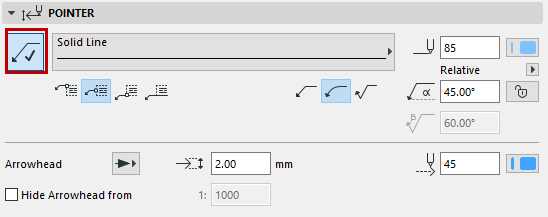
Define a Line type and Pencolor for the Pointer.
Connection Point: Choose where the pointer line should connect with the label: in the middle, at the top or at the bottom; or at the bottom with the text underlined.
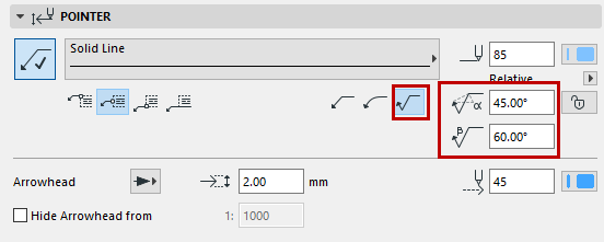
Choose whether the pointer should be straight, curved, or inverted.
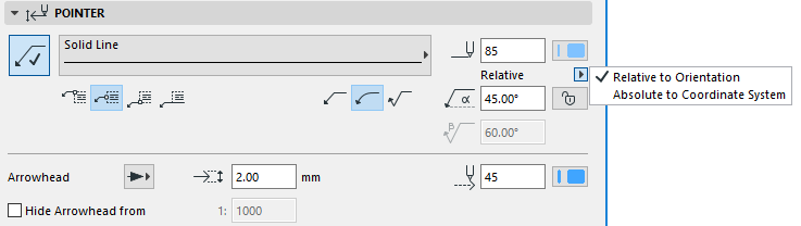
Enter the Pointer Starting Angle using a value from 0 to 90 (the default is 90 degrees).
•The angle is measured from the X axis.
•Use the pop-up to define how this angle value should be interpreted when the element is placed:
- Relative to Orientation (the angle will be measured relative to the Oriented View -
See Set Orientation.
- Absolute to Coordinate System (the angle will be measured from the (0,0) point of the project coordinates).
•Click the lock icon to prevent the angle from being modified graphically (e.g. by accident).
Note: The Lock Angle control affects the range of graphical editing. If it is ON, the Pointer Line’s starting angle remains fixed, limiting the edit possibilities.
If you are using an inverted Pointer line, you can also set the angle of the pointer line’s second breakpoint.
Enter the size of the Arrowhead points (imperial units) or mm (metric units).
Choose a pencolor and style for the Arrowhead.
Hide Arrowhead from: Check this box if you want to hide the pointer line arrowheads on views which exceed a certain scale (enter the desired scale in the field to the right).
See also Graphical Editing of Text Box and Pointer Line.
The Symbol Label panel of Label Settings is only active if you have selected a Symbol Label on the Content and Preview panel.
Click any parameter to select it and to modify its value.
On the right, enter the width and height of the Label.
Enter the Label’s placement angle.
Use symbol color: Display the Symbol Label using the color defined in its GDL script. (If you prefer to use the color you define in the Label Settings Pointer panel, leave this unchecked.)
Label Custom Settings Panel
As for all other GDL Object type elements, the Custom Settings panel is only active if the chosen Label object contains a user interface script.
For tips on the various controls for Symbol labels, see: Custom Settings for Symbol Labels.
This panel is only available if you have chosen a Text-type Label on the Content and Preview panel.
See also Using a Text Label.
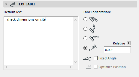
Use the Default Text field to enter a default text and define the Label’s orientation relative to the associated element.
If you save any Label settings as a Favorite, the text entered in the Default Text field will be saved as part of the Favorite; this way you can use the favorites to place Labels with predefined texts.
Note: Favorites of the Text tool can be applied to the text-type items in Dimensions and Labels, and to Fill Text.
Mark one of these buttons to define Label Orientation (not available for Independent labels):
•The Parallel method always places the Labels parallel to the labeled elements.

•The Vertical method always places the Labels vertically. The text is read from bottom to top.

•The Horizontal method always places the Labels horizontally.

•The Custom method places the Labels at the angle you define in the edit field next to it.
Use the pop-up to define how this angle value should be interpreted when the element is placed:
•Relative to Orientation (the angle will be measured relative to the Oriented View)
•Absolute to Coordinate System (the angle will be measured from the (0,0) point of the project coordinates).
For more information, see Set Orientation.
To fix the angle regardless of subsequent rotation of the element, check the Fixed Angle checkbox.
If Fixed Angle is checked, you can also check the Optimize Position box. This means that ARCHICAD will reposition the Label’s arrow if it ends up in an awkward position after the Label is moved or if the view is rotated.
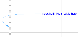
Not optimized Label, after rotation:
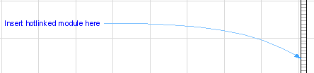
Optimized Label, after rotation:
Hide with Associated Element
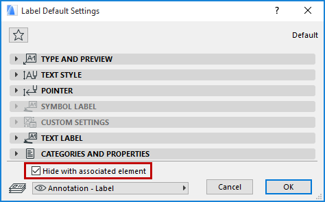
Hide with Associated Element: By default, a Label will be hidden if its associated element is hidden (e.g. on a hidden layer). To display the Label regardless of whether its associated element is visible, uncheck this box.