Energy Performance Evaluation - PDF Report

The PDF header displays custom project information as defined on the Header / Footer Settings dialog.
Key Values
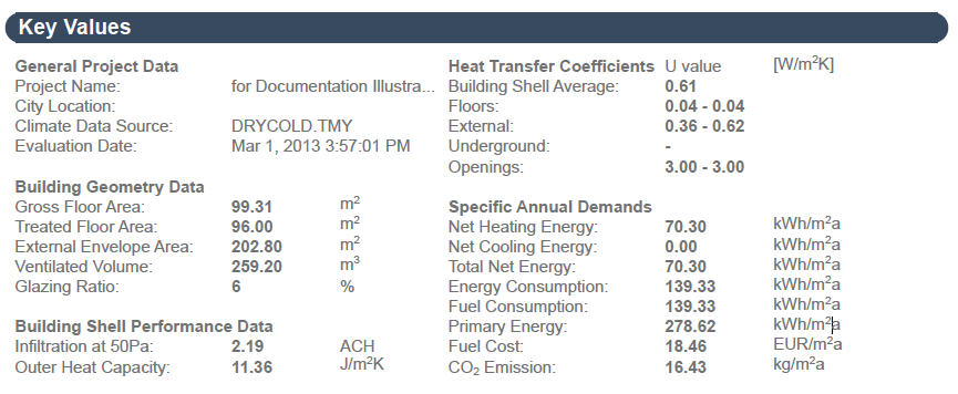
The Key Values section of the PDF Evaluation Report displays the most important project data.
Under General Project Data, basic information, such as Location and Operation Profile, as specified by the user (see Additional Data Assignment and Input). The date of the evaluation is also shown.

The Building Geometry chapter contains result of the model geometry analysis such as areas, volume and glazing ratio.
See Automatic Model Geometry and Material Property Analysis.
The Building Shell Performance Data section displays overall Air Leakage in air change per hour (also called air exchange rate - the number of interior volume air changes that occur per hour in 1/h). Outer heat capacity (measures the capacity of building structures to store heat against changing outside air temperature) is also an important building envelope performance metric.
Also in the Key Values section, the minimum and maximum values of the Calculated heat transfer coefficients are listed for the entire building, for every Building structure group and for the openings on the building shell.
Under Specific annual demands, the most important energy performance data (net demand and gross consumption-related data) - projected to a unit area of the building - are listed, making the comparison of different sized projects possible.
Thermal Blocks
The table in this chapter tabulates the thermal blocks with their geometry data and Operation Profiles.

Monthly Energy Balance Bar Chart
The Monthly Energy Balance bar chart is a graphical display of the amount of energy the building emits (bottom part of chart), as well as the building’s Supplied energy: the amount of energy it absorbs from the environment and its own internal heat sources (top part of chart), by month or week (depending on Energy Performance Evaluation Report Chapter Settings).

According to the energy balance equation - which is the foundation of building physics - the Emitted energy and Supplied energy bars must be equal every month. The vertical axis of the chart shows an energy scale. Along the horizontal axis, the twelve months of the year are shown.
The Monthly Energy Balance Bar Chart shows the cumulative results of the hourly energy balance calculations executed by The VIPCore Calculation Engine.
Energy Supply and Emission Types
To the right of the Monthly Energy Balance diagram, the energy flows that make up the bars of the chart are listed. The number and type of these energy balance components that appear on a particular Energy Evaluation Report depend on the settings on the evaluated building’s Building Systems dialog. Total annual energy flow quantities are displayed in kWh/a.
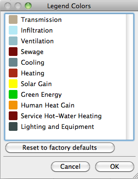
The table below lists all energy supply and emission types with their default Energy Balance bar chart display color.

These energy supply and emission categories, besides being used to visualize the energy balance, also provide addition information on the MEP systems (cooling, heating, ventilation type) and green energy solutions of the evaluated project.
The left column shows the energy flows that appear on the Emitted energy side of the energy balance bar chart, while in the right column the Supplied energy types are listed. The column in the middle contains energy flows that may appear as either emitted or supplied, depending on the particular situation.
Energy flows that are framed with solid lines in the table above require the input of one or more Energy Sources.
See Energy Source.
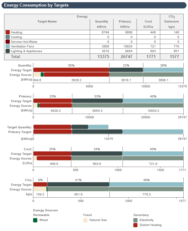
This section of the Evaluation Report contains two tables and several charts.
The table’s far-left column lists energy Targets by name, plus their color codes used in the pie chart. The Quantity column lists the magnitude [e.g. kWh/a] while the Cost column shows the price [currency/a] of energy spent on each target in one year. Next to the Primary energy breakdown, the table’s far-right column shows the carbon footprints associated with the listed energy target magnitudes.

The Distribution by Targets charts graphically display the percentages of the
•Energy quantities
•Primary energy
•Costs
•Carbon footprints
associated with each energy target.
The Target Energy Quantities by Primary Targets bar chart helps users to compare the magnitude of energy consumption with primary energy consumption.
It is possible to display the Energy Consumption chart in either bar or pie chart format.
Primary Energy
The primary energy value is the ‘common denominator’ among different energy source consumption types, when determining the building’s total energy consumption. Not only does it indicate the net energy source consumed, but it also incorporates the energy needed for the manufacturing, transportation and the raw material processing of the energy source, as well as its transportation to the place of use. Minimizing the specific primary energy demand is a great way to improve the designed buildings’ overall performance.
The primary energy factors assigned to the energy sources differ according to building location.
See Project Location and Project North.
Use the Energy Source Factors dialog to enter the region-specific data if available, or evaluate the project using the default assignments (based on standard DINV-18599).
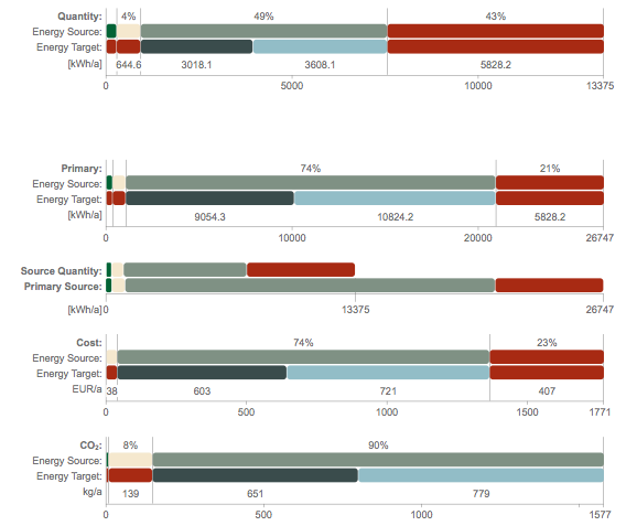
This section of the Evaluation Report contains one table and several charts.

The table’s far-left column lists energy Sources by type (Renewable, Fossil and Secondary) and name, plus their color codes used in the pie chart. The Quantity column lists the magnitude [e.g. kWh/a] while the Cost column shows the price [currency/a] of each energy source consumed in one year.
The table’s far-right column shows the carbon footprints associated with the listed energy source magnitudes.
The Distribution by Sources charts graphically display the percentage distributions of the
•Energy quantities
•Primary energy
•Costs
•Carbon footprints
of the used energy sources.

The Source Energy Quantities by Primary Sources bar chart helps users to compare the magnitude of energy consumption with primary energy consumption.
It is possible to display the Energy Consumption chart in either bar or pie chart format.
This chapter summarizes the environmental impact of the building’s operation, by displaying Carbon Footprint and Primary Energy, according to Energy Sources.
