For a description of generic settings common to all tools in the Toolbox, see Working in Tool Settings Dialog Boxes.
See also Labels.
Double-click the Label tool in the Toolbox or click the Label Settings button in any Tool’s Listing and Labeling panel to open the Label Settings dialog box.
Labels attached to multi-story elements will be displayed only on the element’s Home Story.
Label Content and Preview Panel
The Content and Preview panel defines the labeling options for elements. A preview is available if you have selected a symbol label.
On the left, the element types eligible for labeling are listed. You can set a default labeling format for each element type.
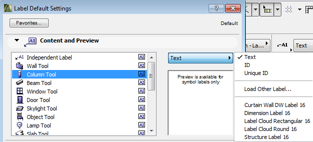
These defaults are applied every time you place an associative label on that element type.
See Placing Associative Labels.
If you choose Independent Label instead of an element, then the default content chosen here will be used every time you place an independent label.
Select an element type, or choose Independent Label, for which you wish to set the Label style and content. (You can select multiple element types here; this way the same default content will be used for each of these elements.)
Choose the Label format from a pop-up list on the right. The options (for labels associated to elements) are:
•Text:. If you choose this option, ArchiCAD will place the Default Text defined here: Label Text Label Panel.
•ID: If you choose this option, the Label will contain the ID of the associated element. Changing the ID field of the selected element will update the Label, too.
•Unique ID:. Each ArchiCAD element has a globally unique, automatically generated ID which is conserved throughout the life of the Project. If you choose this option, the Label will contain this unique ID; however, this unique ID is not accessible or editable by the user.
•Load Other Label followed by the names of the available Label Symbols in the current Library. With the Load Other Label command, you can use Labels that are not currently loaded.
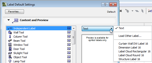
The options for the Independent Label are the same, except that ID and Unique ID are not available.
Below the pop-up, the Preview Area shows the Symbol Label you have chosen from the Library. The Preview is available for Symbol Labels only.
The Text Style panel of the dialog box contains the same controls as described for the Text Tool here: Text Style Panel.
The Label Tool Text Style panel contains two additional checkboxes:
Label Frame: Check or uncheck the checkbox to display your Label text box with or without a frame.
Opaque: Check this box if you want a background color for your label that differs from the screen’s background color. Checking the box activates the pencolor selection settings at right: open the pop-up palette to choose a color.
This panel concerns the Pointer of the Label.
Define a Line type and Pencolor for the Pointer.
Choose whether the pointer should have a straight or a curved pointer line.
Choose where the pointer line should connect with the label: in the middle, at the top or at the bottom; or at the bottom with the text underlined.
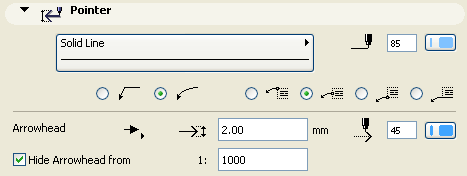
Enter the size of the Arrowhead points (imperial units) or mm (metric units).
Choose a pencolor and style for the Arrowhead.
Note: Symbol Labels (with options chosen in the Symbol Label panel) can override the color and Arrowhead settings made here.
Hide Arrowhead from: Check this box if you wish to hide the Pointer’s Arrowhead if the window scale exceeds a certain value. Enter this minimum scale value for hiding the arrowhead in the field to the right.
The Symbol Label panel of Label Settings is only active if you have selected a Symbol Label (including Object Label) on the Content and Preview panel. It shows options for the Symbol Label’s size and other parameters.
Symbol Labels can have any number of parameters listed on the left. Click any of these parameters to select it and to modify the value of variable.
Check the box to the right of the selected parameter to switch it on, or leave it empty to switch the parameter off.
On the right, enter the width and height of the Label.
Enter the Label’s placement angle.
Use symbol color: Display the Symbol Label using the color defined in its GDL script. (If you prefer to use the color you define in the Label Settings Pointer panel, leave this unchecked.)
Use symbol arrow: Display the Symbol Label using the arrowhead style defined in its GDL script. (If you prefer to use the style you define in the Label Settings Pointer panel, leave this unchecked.)
Label Custom Settings Panel
As for all other GDL Object type element, the Custom Settings panel is only active if the chosen Label object contains a user interface script.
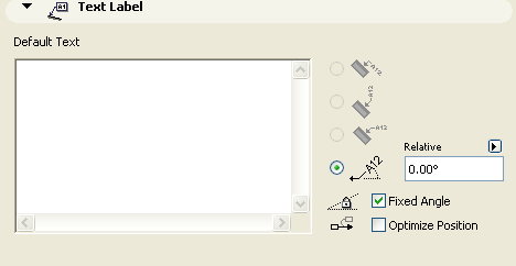
Use the Text Label panel to enter a default text and define the Label’s orientation relative to the associated element. This panel is only available if you have chosen a Text-type Label on the Content and Preview panel.
If you save any Label settings as a Favorite, the text entered in the Default Text field will be saved as part of the Favorite; this way you can use the favorites to place Labels with predefined texts.
Mark one of these buttons to define Label Orientation:
Note: This option is available for all types of Labels except Independent.
The Parallel method always places the Labels parallel to the labeled elements.

The Vertical method always places the Labels vertically. The text is read from bottom to top.

The Horizontal method always places the Labels horizontally.

The Custom method places the Labels at the angle you define in the edit field next to it.
To fix the angle regardless of subsequent rotation of the element, check the Fixed Angle checkbox.
If Fixed Angle is checked, you can also check the Optimize Position box. This means that ArchiCAD will reposition the Label’s arrow if it ends up in an awkward position after the Label is moved or if the view is rotated.
See also Text in Oriented View.