Format Options (Interactive Schedule)
For general information on this feature, see Interactive Schedule.
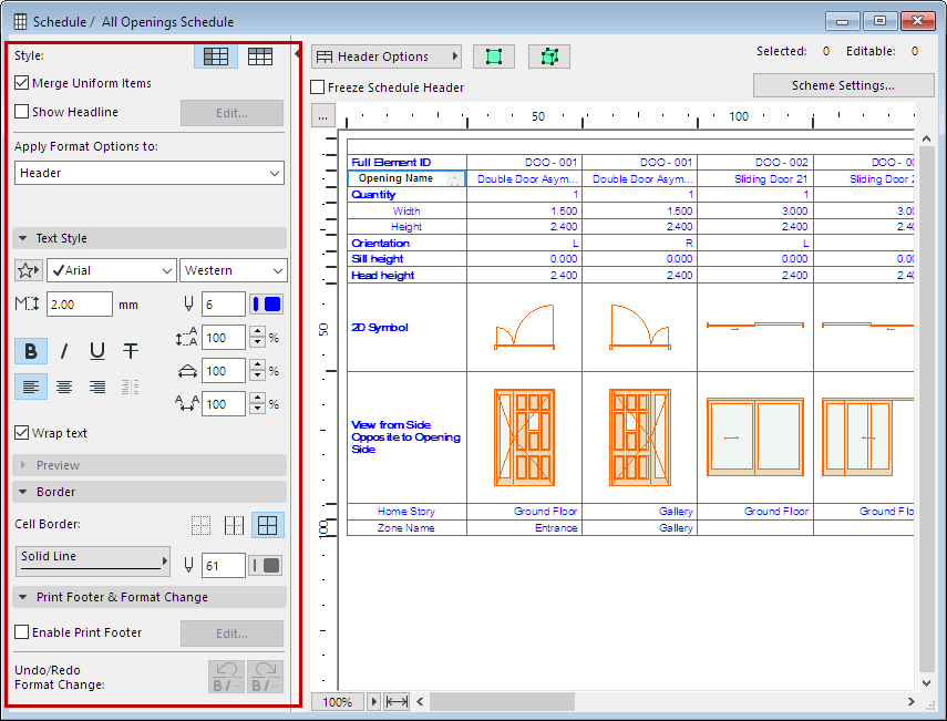
Formatting options for Interactive Schedules are available at the left of every Interactive Schedule window.
General Schedule Formatting
See also Adjust Cell Size and Display Size.
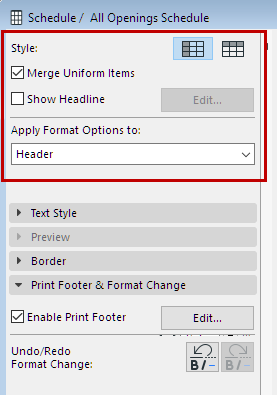
Style
Choose to display the Schedule fields by either rows or by columns.
Check this box to group the Schedule’s identical items in a single record. If it is unchecked, all items will be listed individually.
Items are uniform if the values of their fields are identical (e.g. same element type, surface, orientation). If the only difference between two elements is their area or volume, they are still considered uniform.
Check this box to insert a separate row above the rest of the fields and create sub-headings. Click Edit to open Headline Settings, to define the content and appearance of this headline:
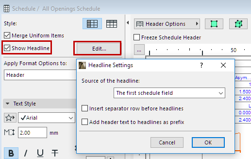
•Source of the headline: The first (or first two, or first three) field(s) of the schedule will be displayed in the headline. If the records are displayed by columns, the first parameter appears in a separate column left of the other parameters.
•Insert separator row before headlines: Check this box to insert an empty row before each headline row.
•Add Header text to headlines as prefix: Check this box to add the Header name as a prefix to its value in the headline row.
See also Header Options, below.
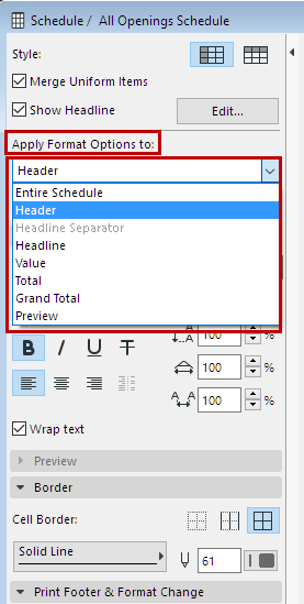
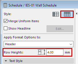
Choose the items that you will format with the controls below. Formatting can either affect the Entire Schedule or any of its items:
Row Heights: (Visible only when Style is set to “by Rows”)
Text Style
Set text format options for the item type selected at Apply Format Options to:
Note: Not available if you have selected “Preview”.
Text Favorite: Click the pop-up to apply Favorites saved with the Text Tool.
See also Apply a Favorite.
Font: Choose a font.
Encoding (Windows only): Choose a regional font encoding.
Font Size: Enter the font height, in mm (metric units) or points (imperial units), depending on the choice defined in Options > Project Preferences > Working Units.
Font Pen: Choose a pencolor with the numeric field or the pop-up control.
Font Style: Select font style(s) (bold, italic, underline, strikethrough).
Note: Header cells can be customized individually. (All other cells are modified collectively, by type.)
Align: Choose an alignment option (left, center, right, by decimal marker).
Leading: This control modifies the leading value (vertical line spacing), as a percentage. Enter a number or use the up-and-down arrows to change the value in increments of 25 percent.
Width Scale: Modify the text character width by entering a percentage value.
Spacing Scale: Modify the spacing between text characters.
Wrap text: Check this option to automatically wrap text to the column width.
Border Format
Set cell border options for the item type selected at Apply Format Options to:
Cell Border:
•None: No border will be drawn.
•Separators Only: The selected line type selected is displayed below each item. If the records are displayed by columns, the line is displayed on the right.
•All Borders: Selected line type is displayed on all sides of the cell.
Border Line Type: Choose a line type for the cell border lines.
Border Pen: Choose a pencolor for the cell border lines.
This panel is available if Apply Format Options to is set to Preview, or if a preview cell is selected in the Schedule.
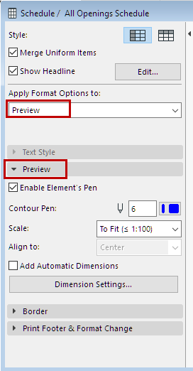
Enable Element’s Pen: If this box is checked, the pencolors defined for the element is used for its preview picture in the schedule. If it is unchecked, choose a pencolor in the Contour Pen field below.
Contour Pen: Choose a pencolor for the preview picture shown in the schedule, if any. Grayed if the Enable Element’s Pen box is checked.
Scale: Use the pop-up to set the optimal scale for the schedule’s Preview pictures. To fit ensures that the picture will fit in the cell, by scaling the preview down if needed (will not scale up).
Align to: Align the preview pictures in this schedule within their cells: Center, Top or Bottom of the cell, or (for 2D previews only) to correspond to their relative elevations from the chosen reference level (Story Zero, Project Zero, or other defined reference level.)
Note: Not available when Scale is “To Fit”.
Add Automatic Dimensions: Add dimension information Previews in this schedule. Dimensions are associative; if the element is modified in the project, the dimensions will be updated.
Note: You can add dimensions manually to any Preview picture by double-clicking its cell, or clicking the on-screen “Annotate” command.
See Previews and Pictures in the Interactive Schedule.
Print Footer and Format Change
Enable Print Footer: Check this box to enable Footer Settings to add a print-only footer to the Schedule.
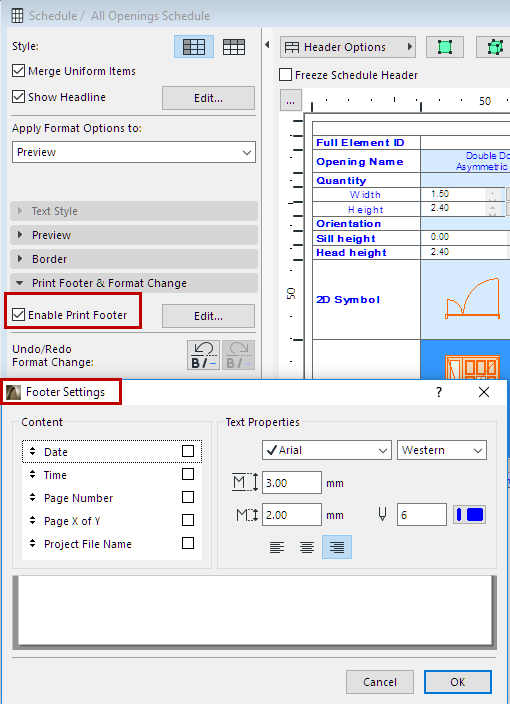
Footer Settings
•Content: Check the items that should appear in the print footer. Use the arrows on the left to modify the order of footer items.
•Text Properties: Set the text format options for the printable footer. Use the preview at the bottom as a guide.
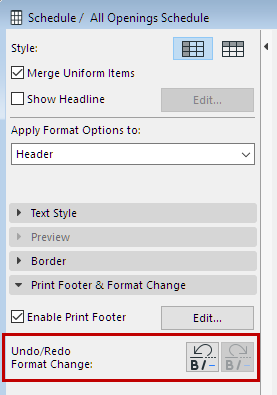
Undo/Redo Format Change
Use these buttons to undo the last changes made to the formatting of the schedule. Click redo as needed.
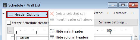
The commands of this pop-up menu refer to the schedule’s Header and sub-header fields.
•Delete selected cell: This is only active if you have manually created a subheader, and have selected that cell for deletion. Not available in any other type of header or other cell.
•Insert header cell above: Use this to create a sub-header for the schedule. First, select two or more headers (use Shift-click to select multiple cells). Then execute the Insert header cell above command. A new cell (named “merged” by default) appears above the selected headers. You can then manually edit the name of this header. Any number of sub-headers can be created in a hierarchical order.
Note: Not available unless you have selected at least two adjoining header cells!
•Hide/Show main header: Hides and shows the main header cell in the Schedule.
•Hide/Show column (row) headers: Hides and shows all header cells in the Schedule except for the main header.
Freeze Schedule Header: Check this box to ensure that header rows (or columns) remain visible when you need to scroll down the elements listed in the schedule. Not available if both the main and column headers have been made invisible in the Header Options pop-up menu.
Select on Floor Plan/3D
For a selected element in the schedule, click Select on Floor Plan or Select in 3D to select it in the corresponding model view.
Note: These buttons are not active if the element selected in the schedule is on a hidden layer.
Note: If nothing in the Schedule is selected, these commands will select all scheduled elements in the Floor Plan/3D window.